
How to find & load Heroicons?
The makers of Tailwind CSS released Heroicons 2.0 in August 23 2022. Some of the icons are named differently then in v1. Therefore, its useful to know how to find icons from v1 and v2.
Where do I find the icon names?
You can search at https://v1.heroicons.com. This shows all icons from version 1. For each version, they have an outline and a solid version (There is also this page https://vue-hero-icons.netlify.app/ that lets you browse all icons with the correct name, however its just working for version 1.).
For the v2 there are now three types, Outline, Solid, and Solid Mini. You can browse them at https://heroicons.com.
Icons use an upper camel case naming convention and are always suffixed with the word Icon.
So if you want to use import icon academic-cap with npm you would need to import AcademicCapIcon.
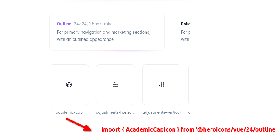
Once you have found the icon name, the question is how to import it from npm (Alternatively, instead of importing, you could also just plain copy the svg).
How to load via npm?
Loading v1 version
For the v1 version there are only 24x24 outline icons, and 20x20 solid icons.
import { BeakerIcon } from '@heroicons/vue/solid'
import { BeakerIcon } from '@heroicons/vue/outline'
Importing and using an icon would look like this:
<template>
  <div>
    <BeakerIcon class="h-5 w-5 text-blue-500"/>
    <p>...</p>
  </div>
</template>

<script>
import { BeakerIcon } from '@heroicons/vue/solid'

export default {
  components: { BeakerIcon }
}
</script>
Loading v2 version
In v2 are three different types that you can pick
import { CalendarIcon } from '@heroicons/vue/24/outline'
import { CalendarIcon } from '@heroicons/vue/24/solid'
import { CalendarIcon } from '@heroicons/vue/20/solid'
Where the 20 or 24 is denoting the size.
Loading an icon would look like this:
<template>
  <div>
    <BeakerIcon class="h-6 w-6 text-blue-500"/>
    <p>...</p>
  </div>
</template>

<script>
import { BeakerIcon } from '@heroicons/vue/24/solid'

export default {
  components: { BeakerIcon }
}
</script>